Monday 28 November 2016

Final Major Project!!

Fireball Express! (Please Read From Right to Left as I mentioned before)

Hello Guys,

This is my manga that I worked on really hard, I know it is not perfect and I expected more from myself but I am happy in how it turned out.

Summary:

Ryu is a teenager (Aged 15), his dad has changed lately and started abusing him since ryu's mom died.  So one day, Ryu runs away from home after his dad beating him up and goes to his usual place to chill (under the bridge).  He sees a glove and he wears it without thinking, then Chu Chu appears out of the glove which is an introduction to the Ryu's powers.  After that, Makkuro gets angry that Ryu saw the the glove.  (To be continued).


After a long process of character design, storyboards and thumbnails, I managed to finish part of my manga that I will continue in the future called Fireball Express.  I was really happy with how this project turned out since it managed to show me how much I improved in these several months of drawing and practicing daily!

Inking in Photoshop was something new to me since I rarely use digital software so it was time consuming.  What I liked about this piece was the usage of screen tones, the different usage of character poses and the story since my old manga had boring front view poses, bad story line and characters and no usage of screen tones.  I think that this piece beats my old manga piece wihtout a doubt since this has better artwork, story and characters.

I could have made this piece better by adding:

A colored cover page

A to be continued text in the last page

better perspective for the bridge in the 5th page


Sunday 27 November 2016

Sketches

Sketches of my manga

Hey guys,

Today I am going to show you my Fireball Express manga sketches.  Sketching the characters and settings was exciting since I never used the deleter paper before. Moreover, I was surprised and happy because of its amazing quality and how easy it was using it.  It made the process less time consuming since It had the measurements that assisted me to draw accurate panels in less time.

I say that since I did not have this kind of paper when I did my first manga, so the paneling was inaccurate and bad.  I consider this as an improvement.


Page 1


Page 2


Page 3


Page 4


Page 5


Steps and differences of Fireball Express

Process, Differences 

Hello guys,

Today I am going to show you how I made my manga by doing a step by step process of how I did it from scratch!


Firstly, it all started by simply drawing the panels of the page using a ruler, pencil, eraser and the measurements of the deleter paper. 


After that, I did the whole sketching process to fill up thee panels and the word bubbles.   Then I took a picture of the sketch to put it on Photoshop.  The reason I took a picture instead of scanning it is because the scanned page looked blurry. 


I started Photoshop by creating a new file that is an International paper sized A4 with 300 resolution for best quality.


Here I started Inking my manga digitally.  So for the panels I used the Squared shape tool that can be shaped into different shapes to ink my panels as seen in the first picture (Red circle).  On the other hand, I used the brush tool to ink everything inside the panels including characters and the setting. 


Making all these squares and inking lines required different layers so every time I did a new thing, I created new layers.  Furthermore, I merged the layers to make it easier for me to work since I am still new to Photoshop.


Because I am on a budget screen tones were too expensive for me since I am an international student living alone and on a budget.  So I managed to find free screen tone brushes for Photoshop by manga artists on Deviant Art which helped me a lot. 


Then, I saved the brushes and I started adding them to my panels.  After that, I erased the lines inside the character.  I did the same process for the other screen tones that you can see above but in different layers. 


Here, I started creating the word bubbles by the same tool that I used for paneling but as a circle tool.  Then I made it transparent from the settings that the arrow is facing and made the line thinner.


So as you can see here that the circles look transparent and simple.  After that, I added text into the word bubbles to fill the story by using the text tool. Then, I used the square tool and added more text into the last panel. 


Finished.


Differences in other pages

there were some differences that I made in other pages of my manga such as:


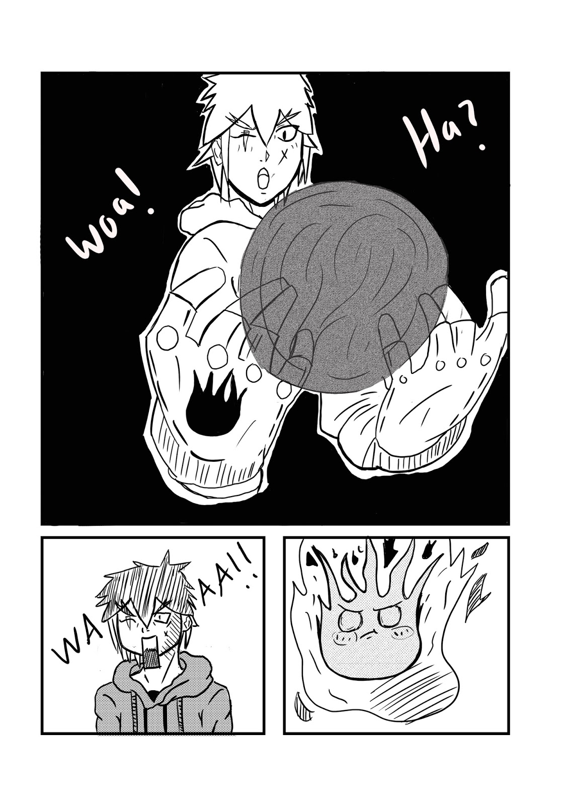
The first difference is, you can notice that these panels are quite bigger than the first page, I did this because it is an important page and I want to catch the eye of the reader.  

The panels where curved at first but I faced problem with shaping them so I changed them into squares.  


Here, as you can see I did not add any black background in the first page because it was not suitable.  So I added a black background in my 3rd and 4th pages. (did not add the 3rd page because I want you to read the manga)


Secondly, I used something different here which was writing with my hand instead of typing using a white brush.


Monday 21 November 2016

Website on Phone

My Website On A Smart Phone

Hello guys,

Today I saw how my website looks on a smart phone using the settings from the Wix website.  It had many errors as you will see in the pictures below.  Overall, I was happy with how the website looks since it looked simple and easy to use on the phone. 


This is how my home page looks like while using a phone.  I quite like how it turned out since it looks simple and aesthetically pleasing with everything shown clearly.


As you can see that the about page looked irritating to the eye because my chuchu character design picture was too large for the phone to handle it  so there were lines cutting the words and making the words irritating and hard to read.  Currently I am still trying to find a solution to fix this problem.


I managed to fix the problem by adding a grey transparent background background to the about page which made the text more visible to the user. Of course it automatically changed on the computer website as well.


At first, The contact page on how to contact me was blocking the picture of my Makkuro character design.


So, I fixed it by sliding the contact me list to the bottom as seen in the 2 pictures above which made my character design visible to the mobile phone users.


AS you can see, this is my gallery page, I am happy with how it looks like because it has a minimal feel to it with the font colors and the black background which makes the user check my work.

Change of Tools (Another Time)

Change of Tools

Hello guys,

Sorry about changing my materials and tools often, the G-pen and ink that I ordered from amazon still did not arrive as the time expected.  So I thought of a better idea.....


Image Link

Instead of using a G-pen since it did not arrive and it is time consuming.  I thought of a better and faster method of inking my manga which is using my Wacom Cintiq 13hd tablet and Photoshop since it will develop my lacking digital skills as an artist and it will be more enjoyable because I am trying a new media.

Another reason for choosing to ink my manga digitally is because this module is called Digital Arts so it would be better to make my work digital to make it more relatable to the course itself.


Image Link

I will still use these pens for only one thing, I will use the 0.8 thick pen to ink the panels traditionally then I will scan the papers to ink the story and put the word bubbles and effects digitally.

Please note that I have used a pencil, an eraser and a ruler to sketch the manga so my project is a mixture of traditional and digital work. 

Feedback on my Blog and Website

Feedback


Hello guys,

Last week my teachers and class gave me feedback about my blog and website (Road to Animation) for myself to upgrade it and listen to different points of view.  I was delighted that some of my friends gave me some constructive criticism  about my website and blog.

Points:

1) Delete the links in the social media links in the gallery

2) It is really good, storyboards, vision,

3) website does not look aesthetically  pleasing

4) delete other artworks (do not put other artists on the website)

5) Fix the website contact and about page.

6) Delete other artists from the website.

7) Lots of sketches, a lot of good research and added most of the stuff I only should work on the major project now.

I did a presentation of my blog and website in front  of all my classmates and they said that my major project definitely shows my progression route Animation.  They liked that I have the storyboards (Thumbnails) of my manga before starting the original work and that I have a good vision of the work.  One of my classmates said that the website does not look aesthetically pleasing because I should delete other artists work o the website, add backgrounds of my work in the about section of the website.  They said that I have enough research and sketches for my major project and all I need to do is start my major project which is the manga itself although the character designs are considered pieces of work too.


Fixing and upgrading my blog and website


I faced some technical difficulties with deleting the unwanted social links because it is not enabling me to actually delete them from the settings on the Wix website.  As you can see in the second picture that there are no links available to delete but they are still showing in the gallery when previewed.

Before:


After:


Here, I listened to one of the classmates and deleted all the works of other artists that I am inspired by since it is my website and I have to show only my work.  As you can see that I have deleted them in the before and after pictures


Here, I changed all of the backgrounds in both my contact and about page to my character designs of my manga (Fireball Express) to make it feel like it is more mine than putting Wix wallpapers. 


I am really thankful for the people who gave me feedback about my work and I hope that they will like the new improvements I added to my website because most of the criticism was on my website rather than my blog. Thank you!