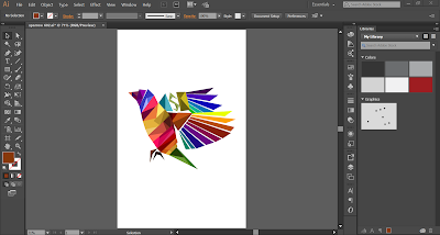
Process of Sparrow
First, we started researching for feathers to study different styles and kinds of feathers. Then, we chose the feathers that were most suitable for our style. please find below the mood board for the feathers we chose:
Mood board
Initial Sketches:
Then, I did the initial sketches of different feather styles. As you can see, that there was a different logo back then which was 'KJN' which follows our names (Khalid for K, J for Jessica and N for Nathan).
Logo Creation:
We first got our idea of the Sparrow logo from the sparrow bird logo which as you can see has a style of abstract triangles which is a unique concept so we got inspiration from it and used the same style for our Sparrow logo. We faced many problems creating the logo since it took time more time than the whole advert. We used Photoshop to make this Advertisement.
After that, we started with the sketching the logo which turned out to be a success since it looked pleasing to the eye with its triangular abstract shapes. We liked the idea, so we continued our work on this logo.
Then, We outlined the logo with black line work to make it look more professional and clean.
Furthermore, we started filling in the colours with the assistance of an abstract triangular shaped palette.
Then, we finished with the logo but we were not happy with the result since we wanted it to be more vintage.
So.....................
We went on and changed the colours of the logo to light and dark brown with the addition of Sparrow with a classical font which made it more vintage.
After that, we used this background since it is similar to our logo. This gave the advertisement a more classical look.
Then, we found the most suitable feather to go with the background and the background of the advertisement through research.
At that time, we added the feather to the background and added a line stroke o the tip point of the feather.
To sum up, we added the motto using a classical font ''One fourth the pressure, three time the speed'' and added the logo under the feather. As you can see, there are 2 types of the advertisement (one with the sparrow on top of the font and one with the sparrow next to the font).
Sources:
Sparrow logo: http://img.zcool.cn/idea/c87853f2e69c6ac722230defd45f.jpg@300w_0e_1l
Abstract triangles filter:
https://blogger.googleusercontent.com/img/b/R29vZ2xl/AVvXsEi4FaAahuXRrTsmKPeSR2r-FCtubVGL_Ny8EOKyUAfjilhgw8Qttu2IgiN1sAbx-geFsNtC4vJhQz0rSiaepniYsluvjrBtiW-N1u4jBxP2WMvJDCNOdbDvDc8ExOvdScGqqFjHnUo6JTeh/s1600/Abstract+Triangles+Wallpapers+2.jpg


Please include a post on your blog about your ideas for the Major Project and website creation, to make sure it is all up to date for Thursday's assessment.
ReplyDelete